Case study · Leeve
How Leeve went from idea to a brand and an app that guide people calmly to the right next step
A complete brand, app and landing page for an AI-assisted absence service in Australia.
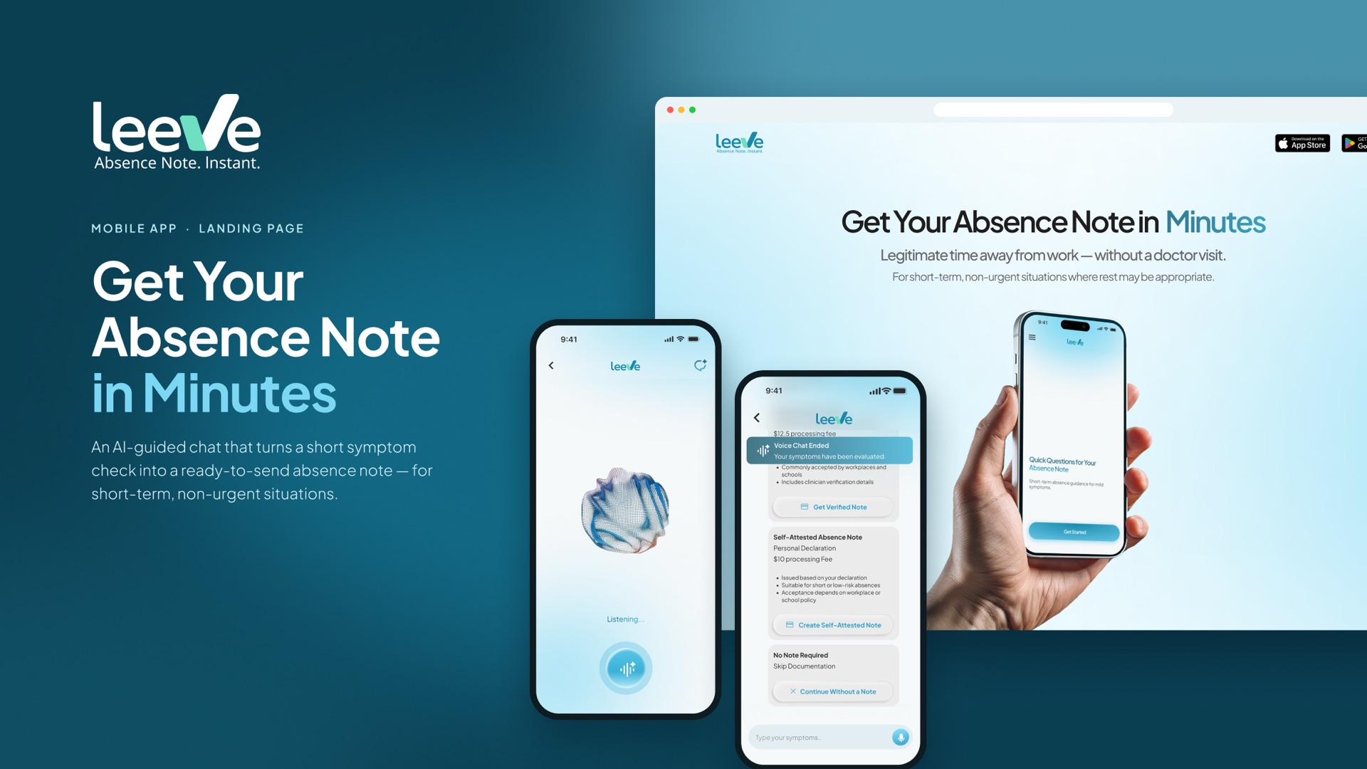
A new service in a sensitive, regulated space, with no brand, no app and a process that had to be explained carefully.
A complete brand, an app live on the App Store and Google Play in Australia, and a landing page that explains the service before download.
The challenge
Leeve gives short-term absence guidance to people with mild, short-lived symptoms. It uses AI-assisted language analysis and a strict rule-based safety framework, not medical diagnosis, to decide the next step: issue an absence note, recommend a GP consultation, or direct the user to emergency care.
As a new service, Leeve needed a complete identity before launch. Every touchpoint, from the logo to the app screens, had to make a sensitive process feel quick and calm, while being completely clear about what Leeve does and doesn't do.
Make a sensitive health process feel quick and calm, without ever sounding like a diagnosis.
How we worked: from business essence to product
- 01Find the one idea the business can't get wrong. We started by talking with Leeve's founders and studying the business and its industry. In Australia, health software and medical certificates sit under clear rules, so we first mapped exactly what Leeve may and may not say or do. That boundary became the core of the brand: clear guidance, with no medical claims.
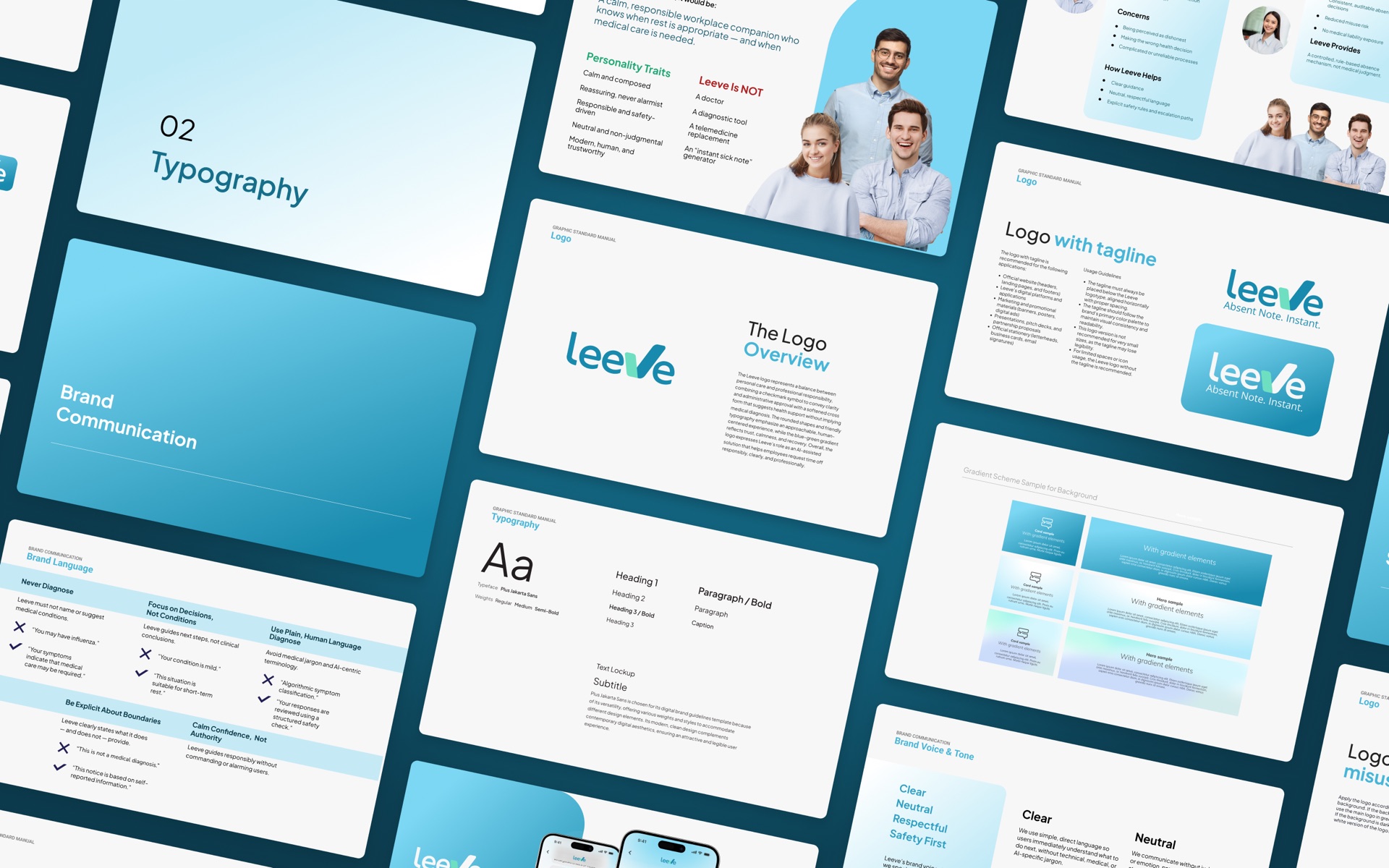
- 02Plan the logo around that idea. A checkmark stands for clarity and administrative approval, while a softened cross suggests health support without implying a medical diagnosis. Rounded shapes and friendly type keep it approachable, and the blue-green gradient signals trust, calm and recovery.
- 03Turn the idea into words people can use. We wrote the brand communication as practical rules, not slogans: what Leeve always says, what it never says, and how the tone shifts from onboarding to emergency guidance. One rule does much of the work: focus on decisions, not conditions.
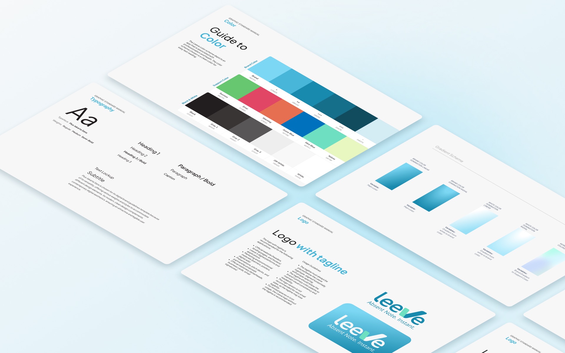
- 04Fix the look in a graphic standard manual. Logo use, colours, typography and visual style, documented so Leeve's team and future partners can keep every touchpoint consistent without asking us.
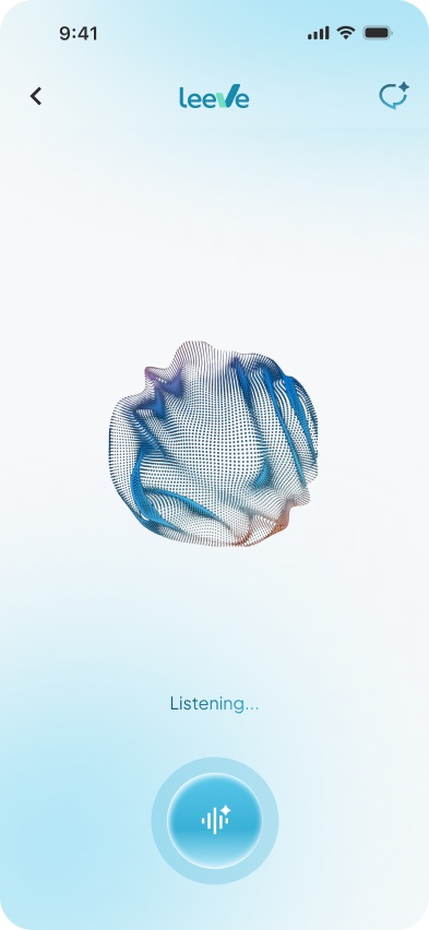
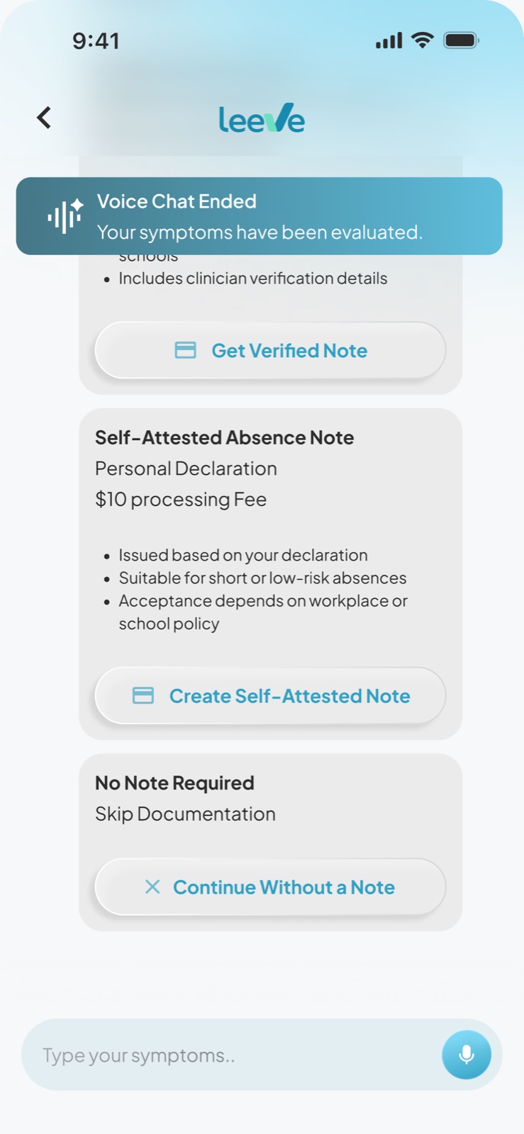
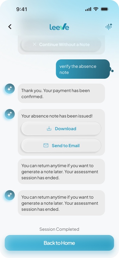
- 05Design the app from the rules. Every screen was written and designed against the communication rules: questions in a calm, chat-style flow, no diagnostic words, and clear escalation when medical care is needed.
- 06Bring it together on the landing page. The promise becomes the headline, and the boundary becomes content: a dedicated "Leeve does not" section tells visitors exactly what to expect.
One idea, every layer
One brand guideline behind every screen
What we built
The app
What made the difference
We started from the business, not the visuals.
The first question was what Leeve must never get wrong; colours and shapes came after.
One idea runs through every layer.
The logo, the words, the manual, the app and the landing page all trace back to the same boundary.
Tools the client can use without us.
The communication rules and the manual are working tools, so Leeve's team can write a new screen or campaign that still sounds and looks like Leeve.
What changed
What Leeve can do now
Leeve launched in Australia with one consistent identity across its app and landing page, and an app that takes users from a few questions to an issued absence note.
- Market: Australia
- iOS and Android, live on the App Store and Google Play
- Brand identity, graphic standard manual, app design and landing page design by Narima
Next step
Build your brand and app with us
Tell us about your project through the form. We reply by email within one business day.